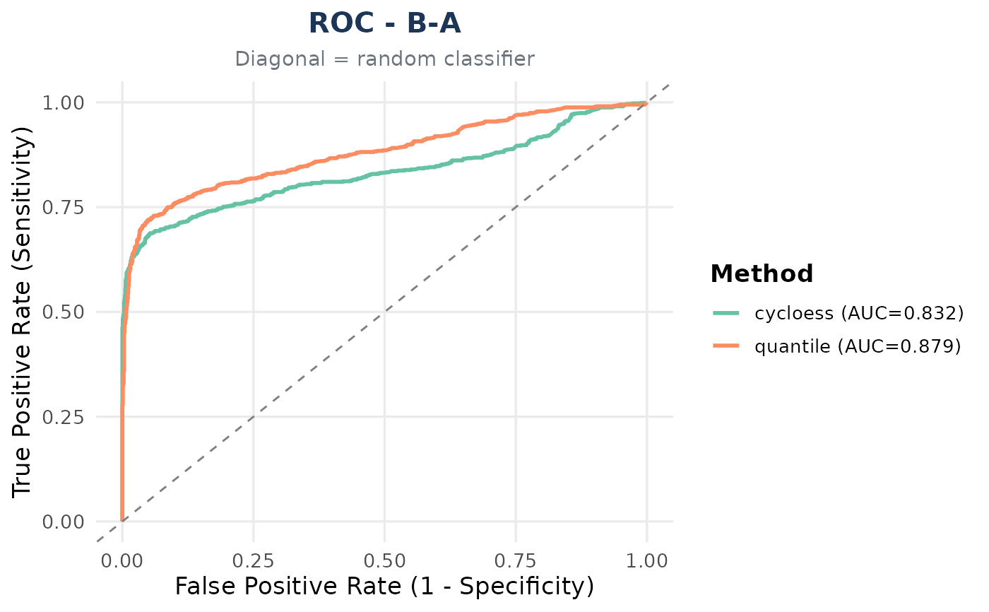
Generates ROC (or ROC zoom) plot where each curve represents a different method (Assay) for one comparison.
Usage
bm_plot_roc(
  classified_combined,
  comparison,
  p_col = "adj.P.Val",
  zoom = FALSE,
  palette = "Set2"
)
Arguments
- classified_combined
data.frame with columns: Assay, Comparison, truth, and a p-value column
- comparison
Character. Single comparison to plot (e.g. "B-A")
- p_col
P-value column name (default: "adj.P.Val")
- zoom
Logical. If TRUE, zoom to FPR 0-10% and show pAUC in legend
- palette
RColorBrewer palette name (default: "Set2")
Examples
data(nadia_dia)
sp <- utils::read.delim(system.file("extdata", "nadia_dia_spikein.tsv.gz",
                                    package = "NADIA"))
ev <- data.frame(Comparison = rep(c("B-A", "D-A"), each = 2),
                 Species = c("ECOLI", "YEAST"),
                 expected_logFC = c(1, -0.58, 2, -3.3))
classified_all <- do.call(rbind, lapply(c("cycloess", "quantile"), function(nm) {
  de <- process_proteomics(nadia_dia, norm_method = nm,
                           verbose = FALSE)$DEPs_results
  de$Species <- sp$PG.OrganismId[match(de$Protein.IDs, sp$PG.ProteinGroups)]
  cl <- benchmarking_proteomics(de, ev, verbose = FALSE)$classified_df
  cl$Assay <- nm
  cl
}))
if (requireNamespace("pROC", quietly = TRUE)) {
  bm_plot_roc(classified_all, comparison = "B-A")
}