Visualisation: exploring and presenting results
Sergio Ciordia
Source:vignettes/visualization.Rmd
visualization.RmdIntroduction
A useful proteomics figure should answer a specific question. A volcano plot summarises differential abundance, a boxplot compares sample distributions, a principal component analysis (PCA) reveals the main sources of variation, and a heatmap displays coordinated protein profiles across individual samples. Pattern Profiler adds a different view by grouping proteins with similar relative trajectories across ordered conditions. These views provide different information; none is a substitute for the others or for the underlying statistical model. NADIA offers this broad set of complementary visualisations so users can select the views that best address their analytical question and communicate the results clearly.
This vignette presents a complete visualisation workflow for NADIA results. It shows how to choose and prepare each plot, how to interpret the example output, which customisation options most often matter, and how to export the result. The interactive functions use highcharter, whereas the publication-oriented heatmap uses tidyHeatmap and ComplexHeatmap.
Setup and example data
This section creates one reproducible analysis that will be reused throughout the vignette. Keeping the data and thresholds constant makes it possible to compare what each visualisation adds to the interpretation.
Installation
NADIA can be installed with BiocManager. The heatmap and
Pattern Profiler packages are optional dependencies and are installed
separately when those visualisations are required.
if (!requireNamespace("BiocManager", quietly = TRUE))
  install.packages("BiocManager")

BiocManager::install(c("NADIA", "ComplexHeatmap", "Mfuzz", "Biobase"))
install.packages(c("tidyHeatmap", "circlize", "e1071"))
Processing the example dataset
The nadia_dia dataset contains three conditions
(A, B, and D) with four
replicates per condition. process_proteomics() returns the
processed experiment and the long-format tables expected by the plotting
and clustering functions.
library(NADIA)
data(nadia_dia)

res <- process_proteomics(nadia_dia, verbose = FALSE)
The sample design should always be checked before a plot is interpreted.
Show the code used to summarise the experimental design
sample_design <- unique(
  res$PCA_Input[c("SampleID", "Condition", "Replicate")]
)

design_summary <- as.data.frame(table(sample_design$Condition))
names(design_summary) <- c("Condition", "Samples")

knitr::kable(
  design_summary,
  row.names = FALSE,
  caption = "Number of samples in each condition of the example experiment."
)| Condition | Samples |
|---|---|
| A | 4 |
| B | 4 |
| D | 4 |
Most plotting functions in this vignette receive ordinary data
frames, such as DEPs_results, BoxPlot_Input,
or PCA_Input. Compatible tables produced by another
workflow can therefore be plotted without recreating the original
SummarizedExperiment.
Pattern Profiler separates clustering from visualisation.
pattern_profiler_analysis() uses se_proc and
DEPs_results to produce long_output; the
plotting functions use this data frame directly, so saved clustering
results can be visualised without rerunning the analysis.
Show the code used to summarise the visualisation inputs
input_summary <- data.frame(
  Object = c("DEPs_results", "BoxPlot_Input", "PCA_Input", "se_proc"),
  Rows = c(
    nrow(res$DEPs_results),
    nrow(res$BoxPlot_Input),
    nrow(res$PCA_Input),
    nrow(res$se_proc)
  ),
  Columns = c(
    ncol(res$DEPs_results),
    ncol(res$BoxPlot_Input),
    ncol(res$PCA_Input),
    ncol(res$se_proc)
  ),
  Used_by = c(
    "Volcano plots and Pattern Profiler",
    "Boxplots",
    "PCA and heatmaps",
    "Pattern Profiler"
  )
)

knitr::kable(
  input_summary,
  row.names = FALSE,
  caption = "Objects returned by process_proteomics() for visualisation."
)| Object | Rows | Columns | Used_by |
|---|---|---|---|
| DEPs_results | 5991 | 12 | Volcano plots and Pattern Profiler |
| BoxPlot_Input | 47928 | 6 | Boxplots |
| PCA_Input | 23964 | 9 | PCA and heatmaps |
| se_proc | 1997 | 12 | Pattern Profiler |
The values are calculated directly with nrow() and
ncol(), but the row count reflects the structure of each
object rather than the number of unique proteins.
DEPs_results contains 1,997 proteins across three
comparisons (5,991 rows), BoxPlot_Input contains the same
proteins across 12 samples and two assays (47,928 rows), and
PCA_Input contains one row per protein and sample (23,964
rows). In the three data frames, Columns counts the
available variables; in se_proc, its 1,997 rows and 12
columns correspond directly to proteins and samples, respectively.
Choosing the appropriate visualisation
Different visualisations answer different analytical questions and require different input objects. The diagram below provides a practical guide to choosing the appropriate plot. For each option, it shows the question being addressed, the required NADIA input, the plotting function and its output, and what each graphical element represents.
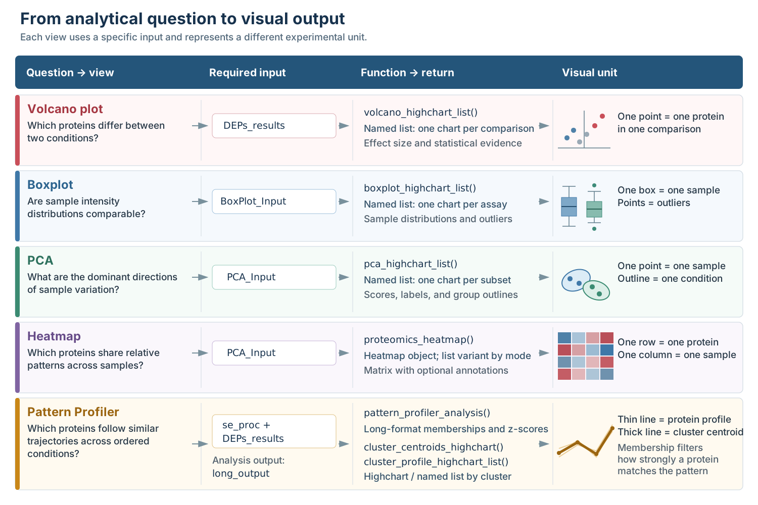
From analytical question to visual output in NADIA. Each row links a recommended view to its input, plotting function or returned object, and graphical unit.
These views are complementary rather than interchangeable. Volcano plots show the results of fitted differential-abundance comparisons, whereas boxplots and PCA describe samples. Heatmaps display protein patterns across samples, and Pattern Profiler groups standardised trajectories across ordered conditions. Their interpretation therefore depends on the preprocessing, protein selection, scaling, thresholds, and sample design used to create them.
Most interactive plotting functions return a named list of
charts. Each name identifies a comparison for volcano plots, an
assay for boxplots, a subset for PCA, or a cluster for Pattern Profiler
profiles. Select a name to display the corresponding chart, as shown
below. cluster_centroids_highchart() is the exception: it
returns one chart containing all selected cluster centroids.
volcanoes <- volcano_highchart_list(res$DEPs_results)
names(volcanoes)
volcanoes[["B-A"]]

boxplots <- boxplot_highchart_list(res$BoxPlot_Input)
names(boxplots)
boxplots[["Impseqrob_min"]]

pcas <- pca_highchart_list(res$PCA_Input, modes = c("all", "any"))
names(pcas)
pcas[["all"]]
Interactive and static output
Interactive charts are particularly useful during exploration: points can be identified from tooltips, axes can be zoomed, and groups can be hidden from the legend. A static heatmap is preferable when dimensions, typography, and vector output must remain fixed for a manuscript.
One volcano plot, one boxplot, one PCA plot, and two compact Pattern Profiler charts are rendered below. Additional variants are shown as code without execution to keep the installed vignette at a reasonable size. The download module is omitted from these five embedded widgets; charts created in a regular R session retain their export menu.
Highcharts licence
Important licensing note. NADIA uses the MIT-licensed R package highcharter as an interface to the Highcharts JavaScript library. Highcharts is distributed under separate terms, and the licence of highcharter or NADIA does not grant a Highcharts licence.
At the time this vignette was revised, Highcharts permitted qualifying personal and educational use under its non-commercial terms, while organisational, production, and commercial uses could require a commercial licence. Users should check the current Highcharts licence for their intended use. The static heatmap workflow does not use Highcharts.
Volcano plots
A volcano plot combines effect size and statistical evidence for one comparison. It is most useful for identifying proteins that are both sufficiently different in abundance and supported by the differential-abundance model.
The function can use sensible defaults, but its main arguments allow
the input, comparisons, decision thresholds, labels, and appearance to
be adapted to the analysis. The expandable guide below summarises the
controls used most often; the complete reference is available in
?volcano_highchart_list.
Show the main parameters of volcano_highchart_list()
Input and plot selection
-
de_res: differential-abundance results containing the protein identifiers, gene names, log2 fold changes, p-values, and comparison labels. -
comparisons: optional comparison names to plot;NULLuses every comparison inde_res. -
ain: optional assay names used to filter a table containing results from several assays.
Thresholds and points
-
alpha: significance threshold applied to the p-values selected byp_col; the default is 0.05. -
lfc_thr: minimum absolute log2 fold change used for classification and the vertical guides; the default is 0. -
p_col: p-value column used on the y-axis and for classification; the default isadj.P.Val, but another column such asP.Valuecan be selected. -
point_size: size of the plotted protein points; the default is 4.
Labels and appearance
-
show_top_genes: number of significant genes labelled automatically, ranked by the selected p-value; the default is 0. -
highlight_genes: gene names to highlight manually, including proteins that do not pass the thresholds. -
colors: custom colours for up-regulated, down-regulated, and non-significant proteins. -
palette: a three-colour paletteer palette; when supplied, it takes precedence overcolors. -
title: optional chart title; comparison inserts the current comparison name.
Return value
- A named list containing one interactive Highcharts object for each selected comparison.
Summarising the selected comparison
Before drawing the figure, it is helpful to count the proteins assigned to each category. The table below applies the same thresholds as the plot: adjusted p-value below 0.05 and absolute log2 fold change of at least 1.
Show the code used to classify proteins and calculate the counts
de_ba <- res$DEPs_results[
  res$DEPs_results$Comparison == "B-A",
  ,
  drop = FALSE
]

volcano_class <- ifelse(
  !is.na(de_ba$adj.P.Val) & de_ba$adj.P.Val < 0.05 & de_ba$logFC >= 1,
  "Up",
  ifelse(
    !is.na(de_ba$adj.P.Val) & de_ba$adj.P.Val < 0.05 & de_ba$logFC <= -1,
    "Down",
    "Not significant"
  )
)

volcano_counts <- as.data.frame(table(
  factor(volcano_class, levels = c("Up", "Down", "Not significant"))
))
names(volcano_counts) <- c("Classification", "Proteins")

n_up <- volcano_counts$Proteins[volcano_counts$Classification == "Up"]
n_down <- volcano_counts$Proteins[volcano_counts$Classification == "Down"]
n_not_significant <- volcano_counts$Proteins[
  volcano_counts$Classification == "Not significant"
]

knitr::kable(
  volcano_counts,
  row.names = FALSE,
  caption = "Protein classification for B-A at adjusted p < 0.05 and |log2FC| >= 1."
)| Classification | Proteins |
|---|---|
| Up | 264 |
| Down | 10 |
| Not significant | 1723 |
Under these criteria, the example contains 264 up-regulated proteins, 10 down-regulated proteins, and 1723 proteins that do not pass both thresholds. The table provides exact counts, which are difficult to estimate from the volcano plot because many points overlap.
Creating and reading the plot
volcano_highchart_list() creates one chart for every
requested comparison. Here, the six most statistically significant
proteins that also pass both thresholds are labelled automatically.
volcanoes <- volcano_highchart_list(
  res$DEPs_results,
  comparisons = "B-A",
  alpha = 0.05,
  lfc_thr = 1,
  p_col = "adj.P.Val",
  show_top_genes = 6,
  title = "Differential abundance: {comparison}"
)

prepare_vignette_highchart(volcanoes[["B-A"]])
The x-axis is the log2 fold change. Positive values indicate greater
abundance in B relative to A, whereas negative
values indicate greater abundance in A. The y-axis is
-log10(adj.P.Val), so stronger statistical evidence appears
higher in the chart. A protein is coloured as up- or down-regulated only
when it passes both the horizontal significance threshold and the
vertical effect-size threshold.
The lfc_thr argument controls the guides and
classification in the figure. It does not rerun
differential-abundance analysis or alter res$DEPs_results.
For the plot and the result table to communicate the same decision rule,
use the same alpha and fold-change threshold in both stages
and record those values.
By default, p_col = "adj.P.Val" controls both the y-axis
and classification. Raw P.Value can be displayed for
diagnostic work, but adjusted values are the appropriate default when
many proteins are tested simultaneously.
Labelling selected proteins and multiple comparisons
Automatic labels are convenient for exploration, while a manually
selected set is usually clearer in a report.
highlight_genes matches the Gene.Names column
and may highlight a protein whether or not it passes the thresholds.
# Label proteins selected for their biological relevance.
highlighted_volcanoes <- volcano_highchart_list(
  res$DEPs_results,
  comparisons = "B-A",
  alpha = 0.05,
  lfc_thr = 1,
  highlight_genes = c("lamB", "yciU", "gltA")
)

highlighted_volcanoes[["B-A"]]

# Build several charts with identical settings.
volcanoes_all <- volcano_highchart_list(
  res$DEPs_results,
  comparisons = c("B-A", "D-A", "D-B"),
  alpha = 0.05,
  lfc_thr = 1,
  title = "Differential abundance: {comparison}"
)

names(volcanoes_all)

volcanoes_all[["B-A"]]
volcanoes_all[["D-A"]]
volcanoes_all[["D-B"]]
Boxplots of sample distributions
Sample-level boxplots provide a compact quality-control view of the intensity distribution. They are useful before and after processing because shifts in location, spread, or shape can reveal samples that deserve closer inspection.
boxplot_highchart_list() controls which assays are
displayed and how their sample distributions are grouped and presented.
The expandable guide below summarises the arguments most relevant to
interpretation and display; the complete reference is available in
?boxplot_highchart_list.
Show the main parameters of boxplot_highchart_list()
Input and assay selection
-
data: long-format intensity table containing the sample, assay, intensity, and condition columns. -
assays: assays to plot;NULLcreates a boxplot for every assay indata.
Grouping and layout
-
color_by: sample-level column used to colour the boxes; the default isCondition. -
group_order: optional order of the groups or conditions in the chart and legend. -
palette: colour vector or named palette used for the groups. -
horizontal: switches between horizontal and vertical boxes; the default isTRUE. -
box_widthandheight: control the box width and overall chart height.
Outliers and titles
-
show_outliers: displays observations beyond the whiskers; the default isTRUE. -
outlier_jitterandoutlier_size: control the horizontal spread and size of outlier points. -
titleandsubtitle: optional text in which{assay}is replaced by the current assay name.
Return value
- A named list containing one interactive Highcharts boxplot for each selected assay.
Comparing assays numerically
The example output contains the initial log2 intensities and the final processed assay. The following summary calculates the median for every sample and then reports the range of those sample medians within each assay.
Show the code used to calculate the sample-median ranges
sample_medians <- aggregate(
  Intensity ~ Assay + Column + Condition,
  data = res$BoxPlot_Input,
  FUN = median,
  na.rm = TRUE
)

median_ranges <- do.call(
  rbind,
  lapply(split(sample_medians$Intensity, sample_medians$Assay), function(x) {
    data.frame(
      Minimum = min(x),
      Maximum = max(x),
      Range = max(x) - min(x)
    )
  })
)

median_ranges$Assay <- rownames(median_ranges)
rownames(median_ranges) <- NULL
median_ranges <- median_ranges[c("Assay", "Minimum", "Maximum", "Range")]
median_ranges[-1] <- lapply(median_ranges[-1], round, digits = 3)

knitr::kable(
  median_ranges,
  row.names = FALSE,
  caption = "Range of sample medians before and after processing."
)| Assay | Minimum | Maximum | Range |
|---|---|---|---|
| Impseqrob_min | 13.735 | 13.986 | 0.251 |
| log2 | 13.805 | 14.606 | 0.801 |
In this dataset, the range of sample medians decreases after
processing. This is consistent with improved alignment of the sample
distributions, but it is not proof that every technical effect has been
removed. Distributional similarity should be considered together with
the experimental design, PCA, and the normalisation diagnostics
described in vignette("choosing-methods").
Creating and reading the boxplot
boxplot_highchart_list() creates one chart for every
requested assay. Here, the list contains only the final processed assay.
Each box spans the first to the third quartile, the central line is the
median, and the whiskers extend to the most extreme values within 1.5
interquartile ranges. Hovering over a box reports these statistics and
the number of finite protein intensities in that sample.
set.seed(42)

boxplots <- boxplot_highchart_list(
  res$BoxPlot_Input,
  assays = "Impseqrob_min",
  color_by = "Condition",
  group_order = c("A", "B", "D"),
  horizontal = FALSE,
  show_outliers = TRUE,
  title = "Processed intensity distributions",
  subtitle = "Assay: {assay}",
  height = 560
)

prepare_vignette_highchart(boxplots[["Impseqrob_min"]])
The medians are closely aligned, while each sample retains a broad intensity range. Alignment is expected after the processing used in this example; complete collapse of the boxes, however, would be suspicious because biological and sampling variation should remain.
The points beyond the whiskers are displayed with
show_outliers = TRUE. They highlight the tails of each
sample distribution but are not automatically erroneous measurements. In
much larger experiments, set show_outliers = FALSE when the
additional points obscure the boxes or make the interactive widget
unnecessarily heavy.
# Display both stages as separate list elements.
boxplots_both <- boxplot_highchart_list(
  res$BoxPlot_Input,
  assays = c("log2", "Impseqrob_min"),
  group_order = c("A", "B", "D"),
  show_outliers = TRUE,
  outlier_size = 2,
  box_width = 16
)

boxplots_both[["log2"]]
boxplots_both[["Impseqrob_min"]]
Principal component analysis
PCA reduces thousands of protein measurements to a small number of directions that capture the largest variation among samples. It is a diagnostic view of similarity, separation, and possible outliers; it is not a significance test.
pca_highchart_list() combines protein-subset selection,
PCA calculation, and graphical presentation. The expandable guide below
summarises the parameters that most strongly affect the resulting
projection; the complete reference is available in
?pca_highchart_list.
Show the main parameters of pca_highchart_list()
Input and protein subsets
-
pca_input: long-format protein-intensity table produced for PCA. -
modes: subsets to plot:all,any, and/or named comparisons such asB-A. -
alpha: adjusted p-value threshold used to select proteins for a named-comparison mode; the default is 0.05. -
filter_samples_to_comparison: for a named comparison, optionally retains only samples from the two conditions involved.
PCA calculation
-
center: centres each protein before PCA; the default isTRUE. -
scale.: scales each protein to unit variance before PCA; the default isTRUE.
Groups, points, and outlines
-
color_by,group_order, andpalette: define the grouping variable, group order, and colours. -
point_sizeandshow_labels: control the sample points and optionalSampleIDlabels. -
addEllipses: adds a group outline when at least three samples are available. -
ellipse_type: uses either an observedconvexhull or a normal-theoryconfidenceellipse. -
ellipse_level: confidence level used whenellipse_type = “confidence”; the default is 0.95.
Return value
- A named list containing one interactive Highcharts PCA plot for each requested mode.
Comparing protein subsets
The proteins included in a PCA influence the pattern of sample variation and separation that can be observed. NADIA supports all proteins, proteins significant in any comparison, or proteins significant in one named comparison. The table below compares the first two choices using the same centering and scaling settings.
Show the code used to compare the PCA protein subsets
pca_scores_all <- build_pca_scores(
  res$PCA_Input,
  mode = "all",
  center = TRUE,
  scale. = TRUE
)

pca_scores_any <- build_pca_scores(
  res$PCA_Input,
  mode = "any",
  center = TRUE,
  scale. = TRUE
)

pca_summary <- data.frame(
  Subset = c("All proteins", "Significant in any comparison"),
  Proteins = c(
    length(unique(res$PCA_Input$FeatureID)),
    length(unique(res$PCA_Input$FeatureID[res$PCA_Input$sig_any %in% TRUE]))
  ),
  PC1 = c(unique(pca_scores_all$PC1_Perc), unique(pca_scores_any$PC1_Perc)),
  PC2 = c(unique(pca_scores_all$PC2_Perc), unique(pca_scores_any$PC2_Perc))
)

names(pca_summary)[3:4] <- c("PC1 variance (%)", "PC2 variance (%)")

knitr::kable(
  pca_summary,
  row.names = FALSE,
  digits = 2,
  caption = "Protein subsets and variance represented by the first two principal components."
)| Subset | Proteins | PC1 variance (%) | PC2 variance (%) |
|---|---|---|---|
| All proteins | 1997 | 37.59 | 11.33 |
| Significant in any comparison | 794 | 79.26 | 9.28 |
With all proteins, PC1 explains 37.59% of the variance. Restricting the analysis to proteins already selected by differential abundance raises this to 79.26%. The stronger separation in the selected subset is expected because the same data were used to select proteins that differ between conditions. It should not be presented as independent validation of those differences.
Creating and reading the PCA plot
pca_highchart_list() can generate several PCA plots in a
single call. The resulting plots are stored in a named list, with one
element for each protein subset requested through modes. In
this example, modes = "all" includes every protein and
therefore produces a single baseline PCA plot. Sample names are
displayed because the dataset contains only 12 samples. The 95%
confidence ellipses summarise where the samples from each condition are
concentrated and how they are distributed in the PCA space.
condition_colours <- c(
  A = "#0072B2",
  B = "#D55E00",
  D = "#009E73"
)

pcas <- pca_highchart_list(
  res$PCA_Input,
  modes = "all",
  color_by = "Condition",
  group_order = c("A", "B", "D"),
  palette = condition_colours,
  addEllipses = TRUE,
  ellipse_type = "confidence",
  ellipse_level = 0.95,
  show_labels = TRUE,
  point_size = 5,
  center = TRUE,
  scale. = TRUE
)

prepare_vignette_highchart(pcas[["all"]])
Nearby points represent samples with similar multivariate protein profiles. Separation highlights major variation, but its biological or technical origin should be checked against the study design and sample-level quality metrics.
The 95% ellipses use each condition’s mean and covariance matrix together with a two-dimensional chi-squared contour to summarise group centre, spread, and orientation. They support visual comparison, while formal separation can be assessed with an appropriate statistical test.
With scale. = TRUE, proteins are standardised to unit
variance and contribute more comparably to the PCA. With
scale. = FALSE, more variable proteins have greater
influence. Because scaling can change sample positions and apparent
group separation, the selected setting should be reported.
Subset modes, ellipses, and sample filtering
To focus the PCA on proteins that are significant in a particular
comparison, pass its name to modes. For example,
modes = "B-A" selects the proteins that differ
significantly between conditions B and A. The
filter_samples_to_comparison argument then determines which
samples are shown: TRUE keeps only samples from
A and B, whereas FALSE plots all
samples, including those from condition D, using the same
set of proteins selected from the B-A comparison.
pca_ba <- pca_highchart_list(
  res$PCA_Input,
  modes = "B-A",
  alpha = 0.05,
  filter_samples_to_comparison = TRUE,
  group_order = c("A", "B"),
  palette = condition_colours[c("A", "B")],
  addEllipses = FALSE,
  show_labels = TRUE
)

pca_ba[["B-A"]]
ellipse_type controls how each condition is outlined in the
PCA plot. The table below compares the geometry and appropriate
interpretation of the two available options, helping you choose between
a convex hull and a confidence ellipse.
| Ellipse type | Geometry | Appropriate interpretation |
|---|---|---|
“convex”
|
Smallest convex polygon containing the observed samples | Describes the observed extent of a group |
“confidence”
|
Covariance ellipse scaled by a chi-squared quantile | Summarises the centre, spread, and orientation of each group under a multivariate-normal model |
At least three samples are required to draw either outline. With
ellipse_type = "confidence" and
ellipse_level = 0.95, the ellipse combines each group’s
mean and covariance matrix with a two-dimensional chi-squared contour.
It therefore provides a consistent summary of group centre, spread, and
orientation, while the displayed points show the individual samples on
which the outline is based.
Heatmaps
A heatmap shows the relative abundance profile of many proteins across samples. It is particularly effective for assessing whether selected proteins form coherent patterns and whether replicates display similar profiles. Unlike Pattern Profiler, it preserves the individual sample columns and does not assign proteins to profile clusters.
proteomics_heatmap() controls protein selection,
scaling, ordering, clustering, annotation, and colour mapping. The
expandable guide below focuses on the parameters that determine what the
heatmap represents and how it should be interpreted; the complete
reference is available in ?proteomics_heatmap.
Show the main parameters of proteomics_heatmap()
Input and protein selection
-
data: long-format protein-intensity table used to construct the heatmap matrix. -
mode: selectsallproteins, proteins significant inanycomparison, or proteins from onetargetcomparison. -
alphaandcomparison: define the significance threshold and named comparison used bymode = “target”. -
feature_ids: explicit proteins to display; when supplied, this selection takes precedence over mode-based filtering.
Scaling, ordering, and clustering
-
scale_data: applies row, column, or no scaling; the default isrow. -
sample_orderandcondition_order: arrange samples by clustering, by condition, or in a custom order. -
cluster_rowsandcluster_columns: control hierarchical clustering of proteins and samples. -
show_row_namesandshow_column_names: control the protein and sample labels.
Annotations and appearance
-
row_annotationandrow_annotation_cols: add selected categorical annotations to proteins. -
row_order_byandsplit_rows_by: order or divide proteins using clustering or annotation columns. -
palette_valueandreverse_palette: choose and optionally reverse the abundance colour scale. -
palette_annotationandshow_annotation: control the condition annotation colours and visibility. -
heatmap_title: optional title displayed above the heatmap.
Return value
-
proteomics_heatmap()returns one tidyHeatmap/ComplexHeatmap object;proteomics_heatmap_list()returns a named list for several modes.
Selecting proteins for the heatmap
Showing every quantified protein is possible but rarely legible.
NADIA provides three filtering modes, and feature_ids can
be used when a focused, explicitly defined panel is needed.
Show the code used to compare the heatmap protein subsets
n_all <- length(unique(res$PCA_Input$FeatureID))
n_any <- length(unique(
  res$PCA_Input$FeatureID[res$PCA_Input$sig_any %in% TRUE]
))
n_ba <- length(unique(
  res$PCA_Input$FeatureID[
    !is.na(res$PCA_Input[["adjP_B-A"]]) &
      res$PCA_Input[["adjP_B-A"]] < 0.05
  ]
))

heatmap_subsets <- data.frame(
  Request = c(
    'mode = "all"',
    'mode = "any"',
    'mode = "target", comparison = "B-A"'
  ),
  Proteins = c(n_all, n_any, n_ba),
  Samples = c(12, 12, 8),
  Interpretation = c(
    "All quantified proteins",
    "Significant in at least one comparison",
    "Significant in B-A; only A and B samples"
  )
)

knitr::kable(
  heatmap_subsets,
  row.names = FALSE,
  caption = "Available protein-filtering modes for the example heatmap."
)| Request | Proteins | Samples | Interpretation |
|---|---|---|---|
| mode = “all” | 1997 | 12 | All quantified proteins |
| mode = “any” | 794 | 12 | Significant in at least one comparison |
| mode = “target”, comparison = “B-A” | 497 | 8 | Significant in B-A; only A and B samples |
Unlike a comparison-specific PCA, mode = "target" in
proteomics_heatmap() automatically restricts the samples to
the conditions in the comparison. The B-A heatmap therefore
contains eight samples rather than all twelve.
Creating and reading a focused heatmap
The complete B-A set contains 497 proteins, which is too
dense for row labels in a vignette. The following code selects the 30
proteins with the smallest adjusted p-values among those
passing the 0.05 threshold.
de_ba_ordered <- de_ba[
  !is.na(de_ba$adj.P.Val) & de_ba$adj.P.Val < 0.05,
  ,
  drop = FALSE
]
de_ba_ordered <- de_ba_ordered[order(de_ba_ordered$adj.P.Val), , drop = FALSE]
ba_top_ids <- head(unique(de_ba_ordered$Protein.IDs), 30)
proteomics_heatmap() creates one heatmap for the
requested protein and sample subset. The selected IDs are supplied
through feature_ids, while mode = "target"
retains the samples from conditions A and B in
the B-A comparison.
proteomics_heatmap(
  res$PCA_Input,
  mode = "target",
  comparison = "B-A",
  feature_ids = ba_top_ids,
  scale_data = "row",
  sample_order = "clustering",
  condition_order = c("A", "B"),
  cluster_rows = TRUE,
  cluster_columns = TRUE,
  show_row_names = TRUE,
  palette_value = "brewer:RdBu",
  reverse_palette = TRUE,
  heatmap_title = "Top B-A protein profiles"
)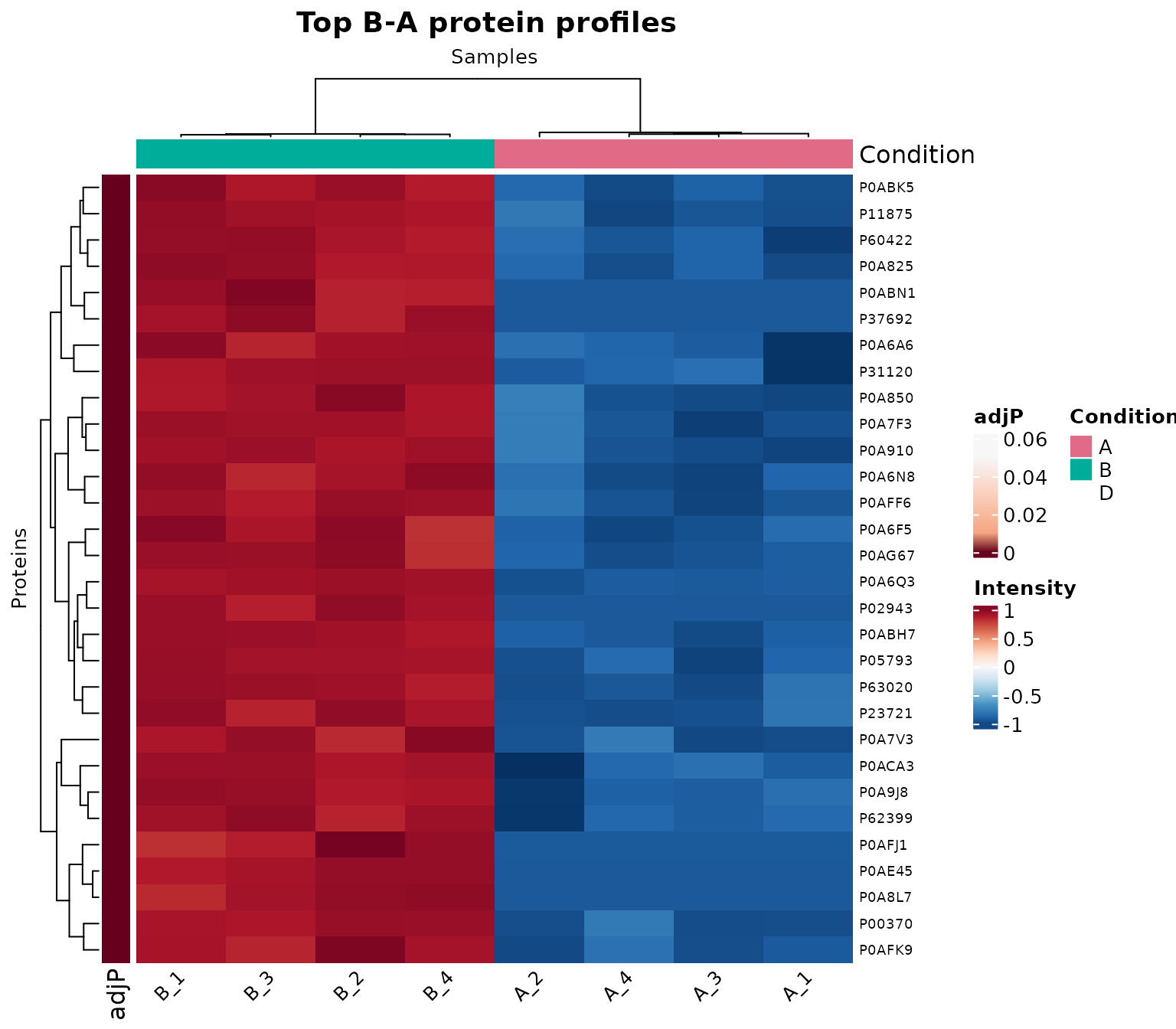
Row-scaled abundance profiles for the 30 proteins with the smallest adjusted p-values in the B-A comparison.
Each row is transformed to a z-score because
scale_data = "row". Warm and cool colours therefore
represent values above and below that protein’s own mean; they do
not indicate that one protein is more abundant than
another. Row clustering groups proteins with similar relative profiles,
while column clustering places samples with similar profiles next to one
another. The condition annotation can then be used to assess whether the
resulting sample clusters are consistent with conditions A
and B.
Use scale_data = "none" when absolute log2 intensity
differences between proteins are the subject of the figure. In that
case, a small number of high-abundance proteins may dominate the colour
range. Column scaling answers a different question and is rarely the
default for protein-profile heatmaps.
Annotations and repeated heatmaps
Categorical protein annotations can be supplied as a data frame
containing a FeatureID column. Rows may be split by one
annotation and ordered by another. Because the 30 proteins used above
all have positive logFC values, they would produce only one
annotation category. For a clearer demonstration, the example below
selects the 15 most significant proteins with higher abundance in
B and the 15 most significant proteins with higher
abundance in A. The resulting annotation and row split are
displayed beneath the code.
ba_higher_b_ids <- head(unique(
  de_ba_ordered$Protein.IDs[de_ba_ordered$logFC > 0]
), 15)

ba_higher_a_ids <- head(unique(
  de_ba_ordered$Protein.IDs[de_ba_ordered$logFC < 0]
), 15)

ba_annotation_ids <- c(ba_higher_b_ids, ba_higher_a_ids)

direction <- ifelse(
  de_ba$logFC[match(ba_annotation_ids, de_ba$Protein.IDs)] > 0,
  "Higher in B",
  "Higher in A"
)

protein_annotation <- data.frame(
  FeatureID = ba_annotation_ids,
  Direction = direction
)

annotated_heatmap <- proteomics_heatmap(
  res$PCA_Input,
  mode = "target",
  comparison = "B-A",
  feature_ids = ba_annotation_ids,
  row_annotation = protein_annotation,
  row_annotation_cols = "Direction",
  row_annotation_palette = list(
    Direction = c("Higher in B" = "#D55E00", "Higher in A" = "#0072B2")
  ),
  split_rows_by = "Direction",
  scale_data = "row",
  sample_order = "condition",
  condition_order = c("A", "B")
)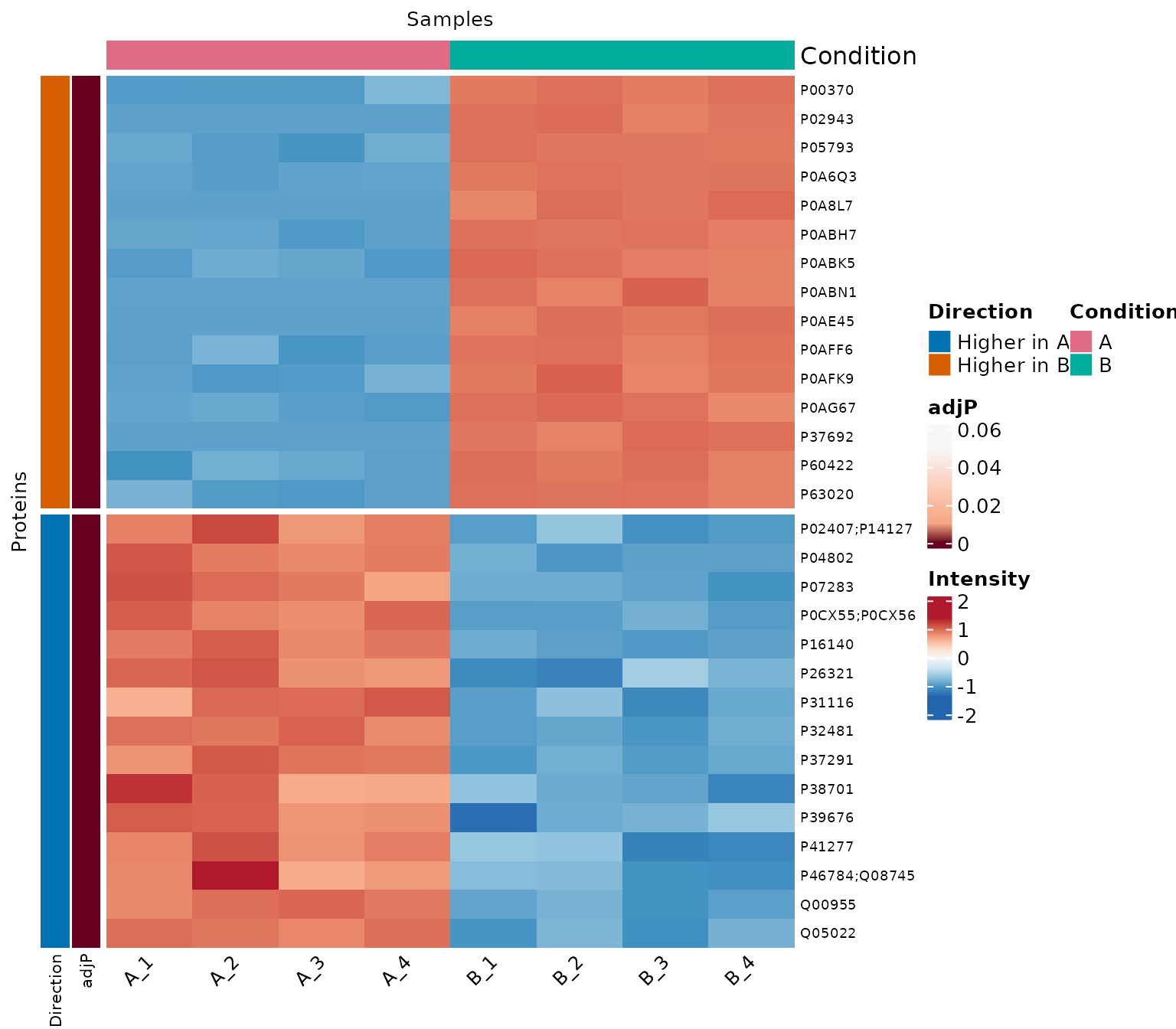
Heatmap of 15 significant proteins with higher abundance in A and 15 with higher abundance in B, annotated and split by direction.
The Direction annotation is derived from the sign of
logFC: positive values are labelled Higher in
B, whereas negative values are labelled Higher in
A. The coloured row annotation identifies these categories, and
split_rows_by = "Direction" separates them into two heatmap
sections. Within each section, the row-scaled colours still represent
values above or below each protein’s own mean. This balanced selection
is used only to illustrate the annotation and should not be interpreted
as the observed proportion of up- and down-regulated proteins in the
complete comparison.
# Build a named list containing several heatmaps.
heatmaps <- proteomics_heatmap_list(
  res$PCA_Input,
  modes = c("any", "B-A", "D-A"),
  scale_data = "row",
  sample_order = "condition",
  condition_order = c("A", "B", "D")
)

# Display the heatmaps individually.
heatmaps[["any"]]
heatmaps[["B-A"]]
heatmaps[["D-A"]]
proteomics_heatmap_list() returns a named list, so
indexing it by mode displays each heatmap separately.
Protein pattern clusters
Pattern Profiler groups proteins that follow similar relative trajectories across ordered conditions. It complements a heatmap by turning recurring profile shapes into explicit clusters and by assigning each protein a fuzzy membership between 0 and 1. This approach is most informative with at least three ordered conditions, such as time points, doses, or disease stages.
This section requires the optional Mfuzz,
Biobase, and e1071 packages. It
focuses on visualising an existing clustering result; see
vignette("pattern-profiler") for cluster-number selection,
membership diagnostics, and data storage.
Pattern Profiler separates clustering from visualisation. The expandable guide below summarises the main controls that determine which proteins are clustered and how the centroid and protein-profile charts are constructed; the dedicated Pattern Profiler vignette provides the complete analysis reference.
Show the main Pattern Profiler analysis and plotting parameters
Analysis input and protein selection
-
se_procandDEPs_results: processed experiment and differential-abundance results used to calculate the clusters. -
assay_name: assay extracted fromse_procand matched inDEPs_results. -
filter_mode: uses proteins significant inanycomparison,allproteins, or proteins from onespecificcomparison. -
alphaandcomparison: significance threshold and comparison used during protein filtering. -
condition_order: order of conditions along every protein trajectory. -
aggregate: combines sample replicates with the median or mean before clustering.
Cluster selection and reproducibility
-
auto_select_c,c_range, andselection_method: evaluate and select a cluster number automatically. -
c: fixed number of clusters used whenauto_select_c = FALSE. -
min_membership: minimum fuzzy membership retained inlong_output. -
seedandseeds: make the final clustering and automatic cluster-number evaluation reproducible.
Centroid and profile charts
-
data: the long-formatlong_outputtable returned bypattern_profiler_analysis(). -
conditions,clusters, andmin_membership: control the x-axis order and the clusters or proteins displayed. -
centroid_summary: represents each cluster with the mean or median trajectory. -
clusterandshow_centroid: select one profile cluster and optionally overlay its centroid. -
line_width,line_opacity,centroid_width, andshow_markers: control the visibility of profile and centroid lines. -
palette,cluster_color, andheight: control chart colours and dimensions.
Return values
-
pattern_profiler_analysis()returns the clustering results andlong_output; the centroid and single-profile functions each return one chart, whilecluster_profile_highchart_list()returns a named list by cluster.
Building and summarising the example clusters
For a concise and reproducible visual example, the analysis below
fixes the number of clusters at two. In a new study, the candidate
solutions should first be compared with
auto_select_c = TRUE and interpreted using the diagnostics
described in the dedicated Pattern Profiler vignette.
pp_vis <- pattern_profiler_analysis(
se_proc = res$se_proc,
DEPs_results = res$DEPs_results,
assay_name = "Impseqrob_min",
filter_mode = "any",
alpha = 0.05,
condition_order = c("A", "B", "D"),
aggregate = "median",
auto_select_c = FALSE,
c = 2,
min_membership = 0.25,
seed = 42,
verbose = FALSE
)A stricter membership threshold is useful for displaying the clearest examples of each pattern. The table reports how many proteins remain at 0.70 and the median standardised profile represented by each cluster.
Show the code used to summarise the Pattern Profiler clusters
display_membership <- 0.70
pp_display <- pp_vis$long_output[
  pp_vis$long_output$Membership >= display_membership,
  ,
  drop = FALSE
]

pattern_summary <- do.call(
  rbind,
  lapply(split(pp_display, pp_display$Cluster), function(x) {
    data.frame(
      Cluster = paste("Cluster", unique(x$Cluster)),
      Proteins = length(unique(x$FeatureID)),
      `Median membership` = median(x$Membership),
      A = median(x$A),
      B = median(x$B),
      D = median(x$D),
      check.names = FALSE
    )
  })
)

pattern_summary[c("Median membership", "A", "B", "D")] <- lapply(
  pattern_summary[c("Median membership", "A", "B", "D")],
  round,
  digits = 3
)

knitr::kable(
  pattern_summary,
  row.names = FALSE,
  caption = paste0(
    "High-membership proteins and median z-score profiles at membership >= ",
    display_membership, "."
  )
)| Cluster | Proteins | Median membership | A | B | D |
|---|---|---|---|---|---|
| Cluster 1 | 378 | 0.961 | 0.633 | 0.520 | -1.153 |
| Cluster 2 | 370 | 0.916 | -1.021 | 0.043 | 0.978 |
The two clusters describe opposing relative trajectories. One pattern
remains comparatively high in A and B before
decreasing in D, whereas the other rises across the ordered
conditions. Because the condition values are within-protein z-scores,
they describe profile shape rather than absolute protein abundance.
Comparing cluster centroids
cluster_centroids_highchart() creates one interactive
chart containing the representative trajectories of all selected
clusters. The median is used here because it is less sensitive than the
mean to proteins near a cluster boundary.
centroid_plot <- cluster_centroids_highchart(
  pp_vis$long_output,
  conditions = pp_vis$conditions,
  min_membership = display_membership,
  centroid_summary = "median",
  title = "Pattern Profiler cluster centroids",
  height = 440
)

prepare_vignette_highchart(centroid_plot)
The separation between the centroid lines shows when the dominant patterns diverge. Hovering over a marker reports the condition and median z-score. The centroids summarise many proteins and should therefore be read together with the cluster sizes and memberships in the preceding table.
Inspecting representative protein profiles
cluster_profile_highchart() creates one interactive
chart for a selected cluster, allowing individual protein profiles to be
compared with their centroid. This reveals whether the profiles are
concentrated around the summary or show substantial heterogeneity. To
keep the interactive vignette responsive, the next chart displays 100
proteins sampled evenly across the membership range retained for cluster
1.
cluster_one <- pp_display[pp_display$Cluster == 1, , drop = FALSE]
cluster_one <- cluster_one[order(cluster_one$Membership, decreasing = TRUE), ]
representative_positions <- unique(round(seq(
  from = 1,
  to = nrow(cluster_one),
  length.out = min(100, nrow(cluster_one))
)))
representative_ids <- cluster_one$FeatureID[representative_positions]
representative_profiles <- cluster_one[
  cluster_one$FeatureID %in% representative_ids,
  ,
  drop = FALSE
]

profile_plot <- cluster_profile_highchart(
  representative_profiles,
  cluster = 1,
  conditions = pp_vis$conditions,
  min_membership = display_membership,
  centroid_summary = "median",
  line_opacity = 0.35,
  title = "Cluster 1: 100 representative protein profiles",
  height = 440
)

prepare_vignette_highchart(profile_plot)
The thin lines are individual standardised protein profiles and the thicker line is their median. A narrow band around the centroid indicates a coherent pattern; marked deviations identify proteins whose assignment deserves closer inspection. Showing only high-membership representatives makes the dominant shape clear, but it does not describe the full uncertainty of the fuzzy clustering.
The complete interactive list can be generated when detailed exploration is more important than vignette size. With hundreds of series, these charts are best inspected in an R session rather than embedded in the installed vignette.
all_profile_plots <- cluster_profile_highchart_list(
  pp_vis$long_output,
  conditions = pp_vis$conditions,
  min_membership = 0.70,
  centroid_summary = "median"
)

all_profile_plots[["Cluster_1"]]
Colours and consistent presentation
NADIA plots can be coloured with either an explicit vector of colour
codes or a named palette. Available themes can be explored in the paletteer
catalogue and the ColorBrewer
catalogue used by RColorBrewer.
An explicit vector gives complete control over each colour and makes
the mapping visible in the analysis script. This is particularly useful
when the same conditions, clusters, or significance categories must
retain identical colours across several publication figures. A named
palette is more concise and makes it easy to compare alternative themes:
paletteer provides a common interface to a large collection
of palettes from many R packages, whereas RColorBrewer
offers a smaller set of qualitative, sequential, and diverging palettes
designed for different types of data.
The following examples use explicit colours. Comments identify the mapping required by each type of plot.
# Pattern Profiler: one colour for each cluster.
cluster_colours <- c("#E63946", "#457B9D")

cluster_centroids_highchart(
  pp_vis$long_output,
  conditions = pp_vis$conditions,
  min_membership = display_membership,
  centroid_summary = "median",
  palette = cluster_colours
)

# Boxplot: colours follow the condition order.
condition_colours <- c(
  A = "#0072B2",
  B = "#D55E00",
  D = "#009E73"
)

boxplot_highchart_list(
  res$BoxPlot_Input,
  assays = "Impseqrob_min",
  group_order = c("A", "B", "D"),
  palette = unname(condition_colours)
)[["Impseqrob_min"]]

# Volcano plot: colours are named by significance category.
volcano_colours <- list(
  up = "#D55E00",
  down = "#0072B2",
  ns = "#BDBDBD"
)

volcano_highchart_list(
  res$DEPs_results,
  comparisons = "B-A",
  colors = volcano_colours
)[["B-A"]]
When a named palette is preferred, paletteer themes use
the "package::palette" format and RColorBrewer
themes use "brewer:PaletteName". The accepted formats vary
slightly between plotting functions, as summarised below.
| Function | Palette argument | Example |
|---|---|---|
volcano_highchart_list() |
paletteer name or
colors = list(up, down, ns)
|
palette = "ggsci::default_jco" |
boxplot_highchart_list() |
paletteer name,
"brewer:Name", or colour vector |
palette = "brewer:Dark2" |
pca_highchart_list() |
paletteer name,
"brewer:Name", or preferably a named vector |
palette = condition_colours |
| Pattern Profiler Highcharts |
ggsci palette through
paletteer, "brewer:Name", or colour
vector |
palette = "ggsci::default_jco" |
proteomics_heatmap() |
Separate paletteer or
RColorBrewer palettes for values and annotations |
palette_value = "brewer:RdBu" |
For example, the following call uses a named paletteer
theme instead of specifying the three volcano-plot colours
individually.
volcano_jco <- volcano_highchart_list(
  res$DEPs_results,
  comparisons = "B-A",
  palette = "ggsci::default_jco"
)

volcano_jco[["B-A"]]
Exporting figures and data
Export should preserve both the visual result and the data used to create it. Interactive widgets can be shared as HTML, while heatmaps can be written as raster or vector graphics together with their displayed matrix.
Interactive charts
Every NADIA Highchart includes a download menu for PNG, SVG, and PDF output. The menu is disabled only in the five embedded examples above to keep this self-contained vignette compact and robust. For a fully interactive copy, save the original chart or selected list element as an HTML widget.
htmlwidgets::saveWidget(
  volcanoes[["B-A"]],
  file = file.path(tempdir(), "volcano_B-A.html"),
  selfcontained = TRUE
)

htmlwidgets::saveWidget(
  centroid_plot,
  file = file.path(tempdir(), "pattern_centroids.html"),
  selfcontained = TRUE
)
A self-contained widget is convenient for sharing, but it remains subject to the Highcharts licence described above. The file also contains the plotted data, so it should not be used to distribute confidential results without review.
Static heatmaps
For proteomics_heatmap(), export_path
writes the displayed matrix and metadata to a TSV file, whereas
export_file writes the figure. The plot format is inferred
from the extension (.png, .svg, or
.pdf).
proteomics_heatmap(
  res$PCA_Input,
  mode = "target",
  comparison = "B-A",
  feature_ids = ba_top_ids,
  scale_data = "row",
  sample_order = "condition",
  condition_order = c("A", "B"),
  export_path = file.path(tempdir(), "heatmap_B-A_data.tsv"),
  export_file = file.path(tempdir(), "heatmap_B-A.png"),
  plot_width = 8,
  plot_height = 7,
  export_dpi = 300
)
When proteomics_heatmap_list() is used, the mode is
appended to each export name. For example, a base name of
heatmap.png produces files such as
heatmap_any.png and heatmap_B-A.png.
The companion vignette vignette("results-and-export")
describes additional ways to save complete NADIA analyses, result
tables, and interactive objects.
Practical recommendations
The most defensible visualisation workflow begins with the analytical question and ends with a reproducible export. The following practices help keep figures clear and their interpretation proportionate to the evidence:
- inspect the sample design and the number of observations before plotting;
- state the adjusted p-value and fold-change thresholds used in volcano plots;
- compare boxplots before and after processing, without treating similar boxes as proof that all technical variation has disappeared;
- begin PCA with all proteins, then label analyses of selected proteins as supervised or selection-dependent views;
- use row-scaled heatmaps for relative profiles and unscaled heatmaps for absolute log2 abundance;
- use Pattern Profiler when conditions have a meaningful order, evaluate the number of clusters and membership threshold, and interpret its z-scores as relative trajectories rather than absolute abundance;
- reuse explicit colours and sample orders across related figures;
- avoid dense labels when tooltips or a focused protein panel communicate the result more clearly; and
- save the plotted data and the analysis parameters together with the figure.
No single figure validates an analysis. Agreement among the experimental design, quality-control summaries, model results, and several complementary visualisations provides a much stronger basis for interpretation.
Session information
The package versions used to build this vignette are recorded below to support reproducibility.
sessionInfo()
#> R version 4.6.1 (2026-06-24)
#> Platform: x86_64-pc-linux-gnu
#> Running under: Ubuntu 24.04.4 LTS
#>
#> Matrix products: default
#> BLAS:   /usr/lib/x86_64-linux-gnu/openblas-pthread/libblas.so.3
#> LAPACK: /usr/lib/x86_64-linux-gnu/openblas-pthread/libopenblasp-r0.3.26.so;  LAPACK version 3.12.0
#>
#> locale:
#>  [1] LC_CTYPE=C.UTF-8       LC_NUMERIC=C           LC_TIME=C.UTF-8        LC_COLLATE=C.UTF-8
#>  [5] LC_MONETARY=C.UTF-8    LC_MESSAGES=C.UTF-8    LC_PAPER=C.UTF-8       LC_NAME=C
#>  [9] LC_ADDRESS=C           LC_TELEPHONE=C         LC_MEASUREMENT=C.UTF-8 LC_IDENTIFICATION=C
#>
#> time zone: UTC
#> tzcode source: system (glibc)
#>
#> attached base packages:
#> [1] tcltk     stats     graphics  grDevices utils     datasets  methods   base
#>
#> other attached packages:
#> [1] NADIA_0.99.1       DynDoc_1.90.0      widgetTools_1.90.0 BiocStyle_2.40.0
#>
#> loaded via a namespace (and not attached):
#>   [1] gridExtra_2.3.1             rlang_1.3.0                 magrittr_2.0.5
#>   [4] clue_0.3-68                 GetoptLong_1.1.1            otel_0.2.0
#>   [7] matrixStats_1.5.0           e1071_1.7-17                compiler_4.6.1
#>  [10] png_0.1-9                   systemfonts_1.3.2           vctrs_0.7.3
#>  [13] stringr_1.6.0               pkgconfig_2.0.3             shape_1.4.6.1
#>  [16] crayon_1.5.3                fastmap_1.2.0               XVector_0.52.0
#>  [19] backports_1.5.1             rmarkdown_2.32              ragg_1.5.2
#>  [22] highcharter_0.9.5           purrr_1.2.2                 xfun_0.60
#>  [25] cachem_1.1.0                jsonlite_2.0.0              tidyHeatmap_1.13.1
#>  [28] DelayedArray_0.38.2         broom_1.0.13                parallel_4.6.1
#>  [31] cluster_2.1.8.2             R6_2.6.1                    bslib_0.12.0
#>  [34] stringi_1.8.9               RColorBrewer_1.1-3          limma_3.68.5
#>  [37] rlist_0.4.6.2               Mfuzz_2.72.0                rrcov_1.7-7
#>  [40] GenomicRanges_1.64.0        lubridate_1.9.5             jquerylib_0.1.4
#>  [43] Seqinfo_1.2.0               bookdown_0.48               assertthat_0.2.1
#>  [46] SummarizedExperiment_1.42.0 iterators_1.0.14            knitr_1.51
#>  [49] zoo_1.9-0                   IRanges_2.46.0              splines_4.6.1
#>  [52] Matrix_1.7-5                timechange_0.4.0            tidyselect_1.2.1
#>  [55] abind_1.4-8                 yaml_2.3.12                 viridis_0.6.5
#>  [58] doParallel_1.0.17           codetools_0.2-20            curl_8.0.0
#>  [61] lattice_0.22-9              tibble_3.3.1                withr_3.0.3
#>  [64] Biobase_2.72.0              quantmod_0.4.29             S7_0.2.2
#>  [67] evaluate_1.0.5              desc_1.4.3                  rrcovNA_0.5-3
#>  [70] proxy_0.4-29                norm_1.0-11.1               xts_0.14.2
#>  [73] circlize_0.4.18             pillar_1.11.1               BiocManager_1.30.27
#>  [76] MatrixGenerics_1.24.0       tkWidgets_1.90.0            foreach_1.5.2
#>  [79] stats4_4.6.1                pcaPP_2.0-5                 generics_0.1.4
#>  [82] TTR_0.24.4                  S4Vectors_0.50.2            ggplot2_4.0.3
#>  [85] scales_1.4.0                class_7.3-23                glue_1.8.1
#>  [88] tools_4.6.1                 dendextend_1.19.1           robustbase_0.99-7
#>  [91] data.table_1.18.6.1         reactable_0.4.5             mvtnorm_1.4-2
#>  [94] fs_2.1.0                    grid_4.6.1                  tidyr_1.3.2
#>  [97] colorspace_2.1-3            patchwork_1.3.2             cli_3.6.6
#> [100] textshaping_1.0.5           S4Arrays_1.12.0             viridisLite_0.4.3
#> [103] ComplexHeatmap_2.28.0       dplyr_1.2.1                 DEoptimR_1.2-1
#> [106] gtable_0.3.6                sass_0.4.10                 digest_0.6.39
#> [109] BiocGenerics_0.58.1         SparseArray_1.12.2          rjson_0.2.23
#> [112] htmlwidgets_1.6.4           farver_2.1.2                htmltools_0.5.9
#> [115] pkgdown_2.2.1               lifecycle_1.0.5             statmod_1.5.2
#> [118] GlobalOptions_0.1.4